Island Health is in the process of refreshing its visual identity to improve accessibility, clarity, and consistency across all platforms. This update includes a refreshed logo, an updated colour system, and the adoption of BC Sans as our primary font.
Use of Island Health Logo
As we complete this transition, our updated style guide, which will outline the rules for proper logo use, is still being finalized. Until this guide is publicly available, Island Health is temporarily limiting general access to logo files to ensure the logo and associated brand elements are applied correctly and consistently.
If you are an external partner and require the logo for a specific approved purpose, please contact brand@islandhealth.ca. Include details about how the logo will be used and the Island Health contact or team you are working with. Approved partners will be provided with the correct file for that specific application.
If you are an internal staff member, Request Logo Access Here.
The Island Health logo may not be reproduced, edited, or redistributed without written permission from Island Health.
Indigenous Health Logo

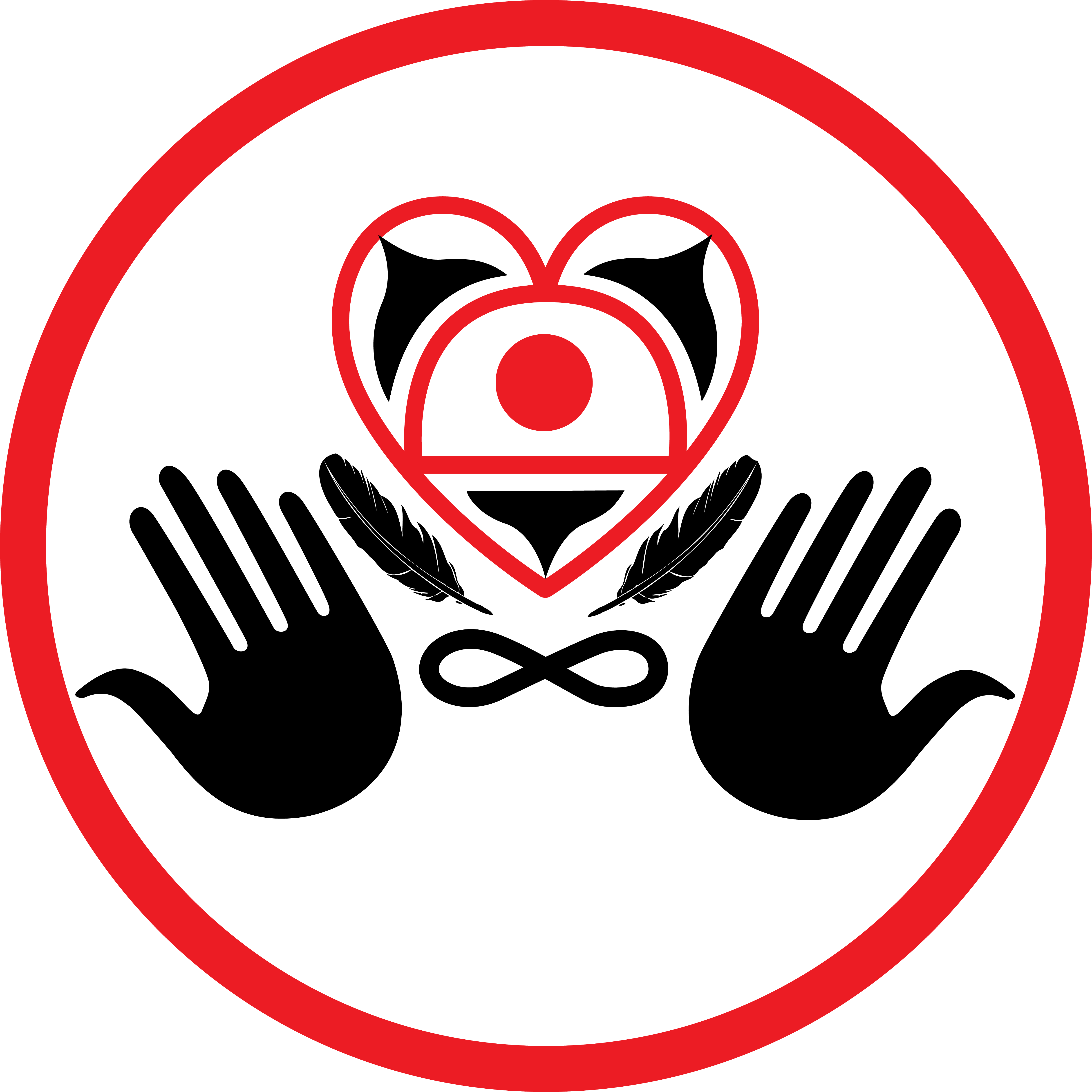
Island Health’s Cultural Safety logo, created by Ray MacGuire and Dale Letourneau in 2011, depicts the elements of a culturally safe environment for clients and families.
The two hands signify a welcoming place of care, while the eagle feathers symbolize the importance of providing care that honours and respects the whole person. The hands hold up a heart, signifying the importance of providing health care with an open heart and open mind. The center of the heart is a circle representing the person at the heart of receiving care.
The Orca whale tails surrounding the person remind us of the importance of family and the three distinct First Nations of Vancouver Island. The infinity symbol at the base of the heart acknowledges the Metis Nation.
Together, these symbols signify the inclusiveness of all cultures and the right of people to receive health and care services that are culturally safe.
